December 7, 2023
Contents design guideline from Material I/O Part.3
UI text should be understandable by anyone, anywhere

Eugene,
UX/UI Designer

Effective writing describes the meaning and context for screen reader users. For that, UI text should be understandable by anyone, anywhere. Let's take a closer look and figure out effective writing guidance.
UX writing best practices
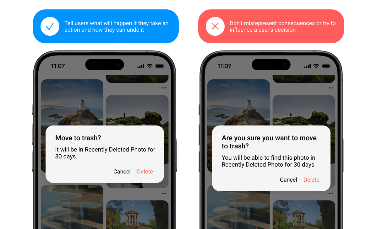
Explain consequences
Emphasize the results of the user’s potential action in neutral, direct language. Avoid cautions or warnings that might sound alarming, intimidating, or condescending. Focus instead on communicating the consequences of a function.
Use scannable words and formats
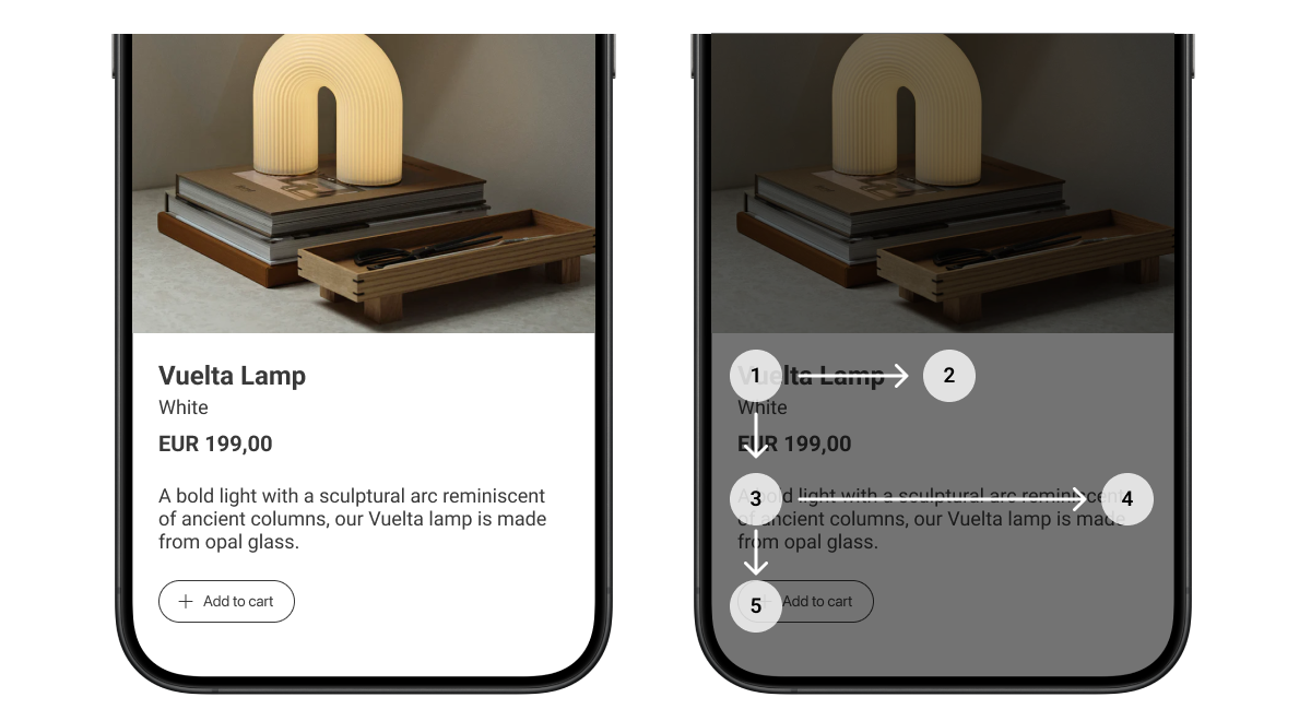
People scan UI text in search of the most meaningful content to them. Help by using specific titles and headings that clearly describe a topic. When users are skimming or hurrying through an action, this organization helps them avoid mistakes and unintentional actions.
Use headings and subheads to prioritize and group information
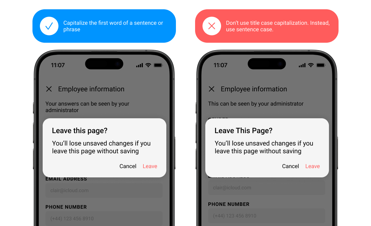
Use sentence case
Unless otherwise specified, use sentence-style capitalization, where only the first letter of the first word in a sentence or phrase is capitalized. All text, including titles, headings, labels, menu items, and buttons should use sentence-style capitalization.
Products and branded terms may also be capitalized.
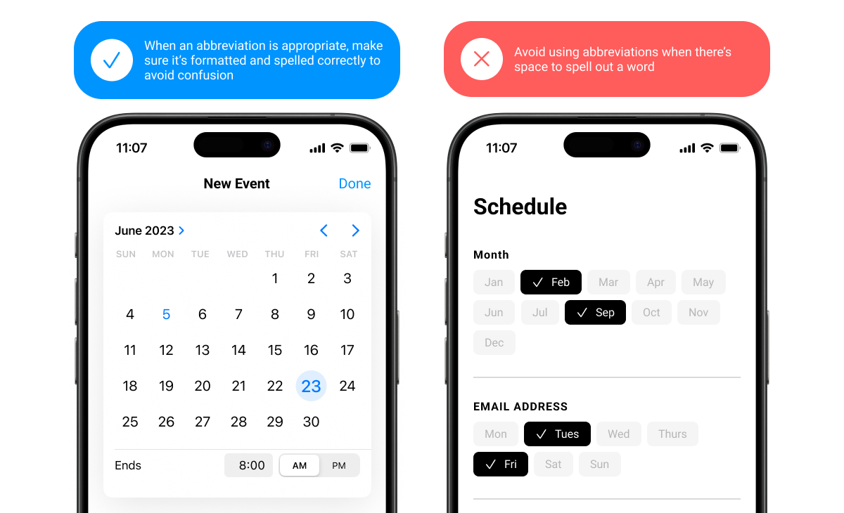
Use abbreviations sparingly
Spell out words whenever possible. Shortened forms of words can be difficult for people to understand and screen readers to read. Avoid Latin abbreviations in UI text such as e.g. or etc. Instead, use full phrases like "for example," or "and more."
Word choice
Use second person pronouns (“you”)
Use the second-person pronouns “you” and “your” to help the user to feel like the UI is talking to them and referring to their actions
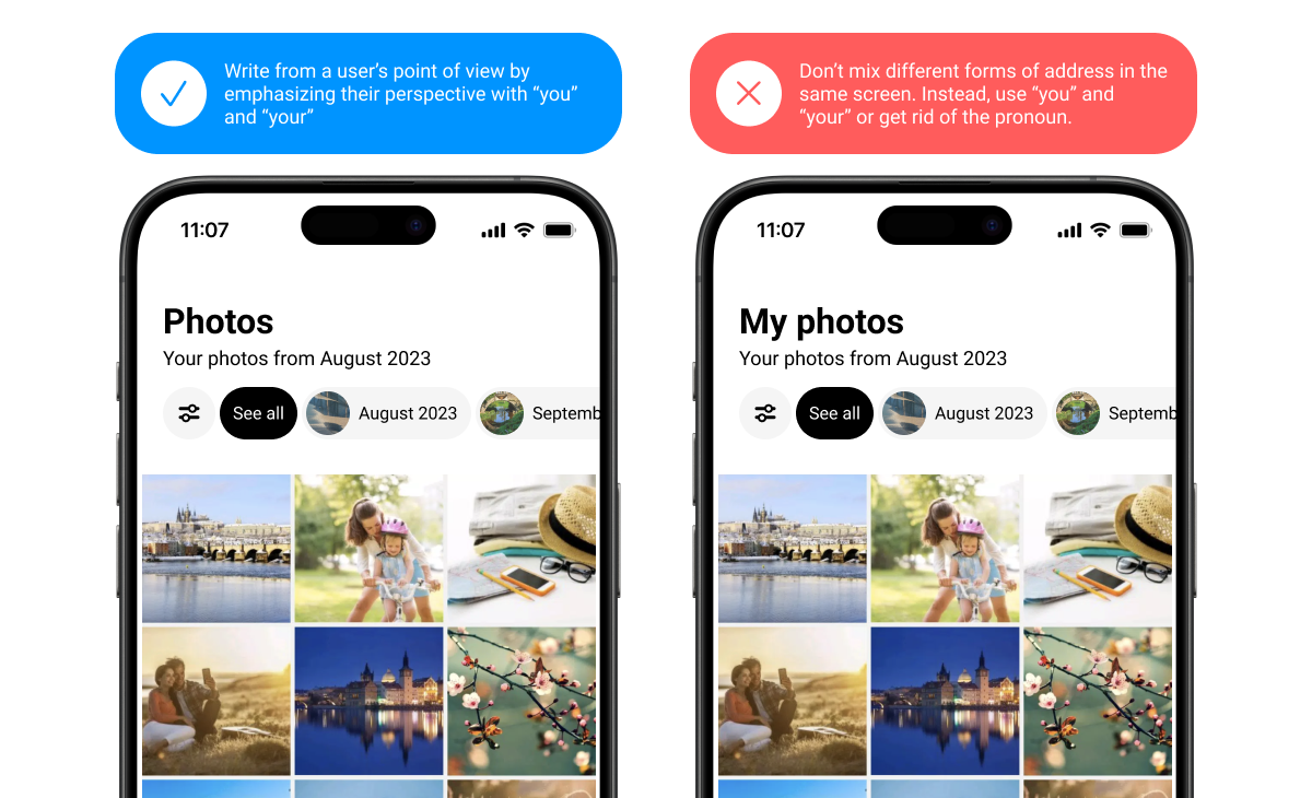
Don’t combine first and second person
Avoid mixing "me" or "my" with "you" or "your.” It can cause confusion to see both forms of address in the same context.
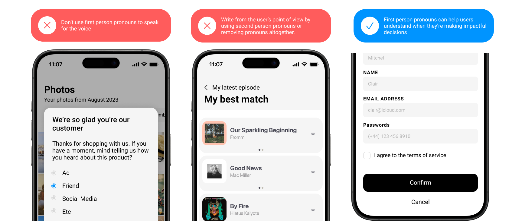
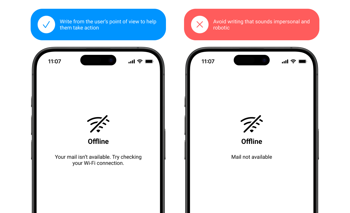
Use caution with “I” and “we”
When written on behalf of an application, “we” or “I” may come across as robotic or disconcerting.
Focus on the user’s point of view and consider if it’s possible to rewrite a phrase without “we.”
Grammar and punctuation
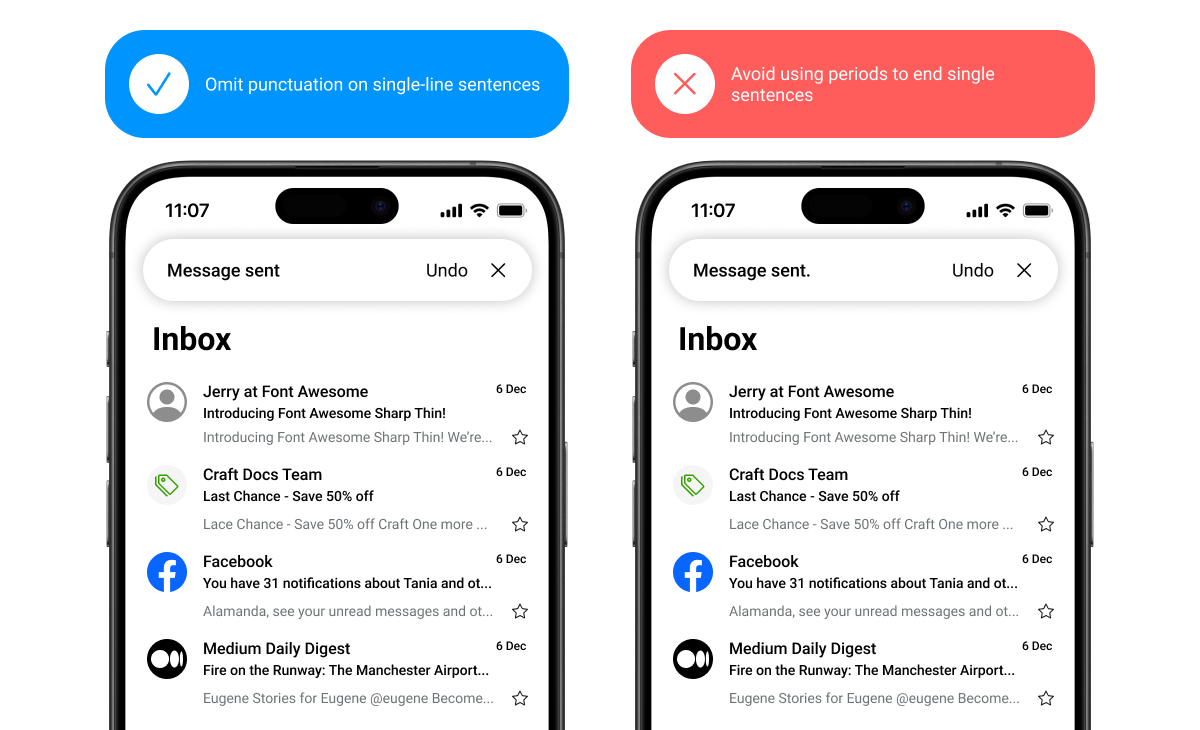
Skip periods and unnecessary punctuation
To help readers scan text, avoid using periods and other unnecessary punctuation.
Avoid using periods to end single sentences, particularly in:
Labels / Tooltip text / Bulleted lists / Dialog body text / Hyperlinked text
Use periods on:
Multiple sentences / Long or complex sentences, if it suits the context / Any sentence followed by a link
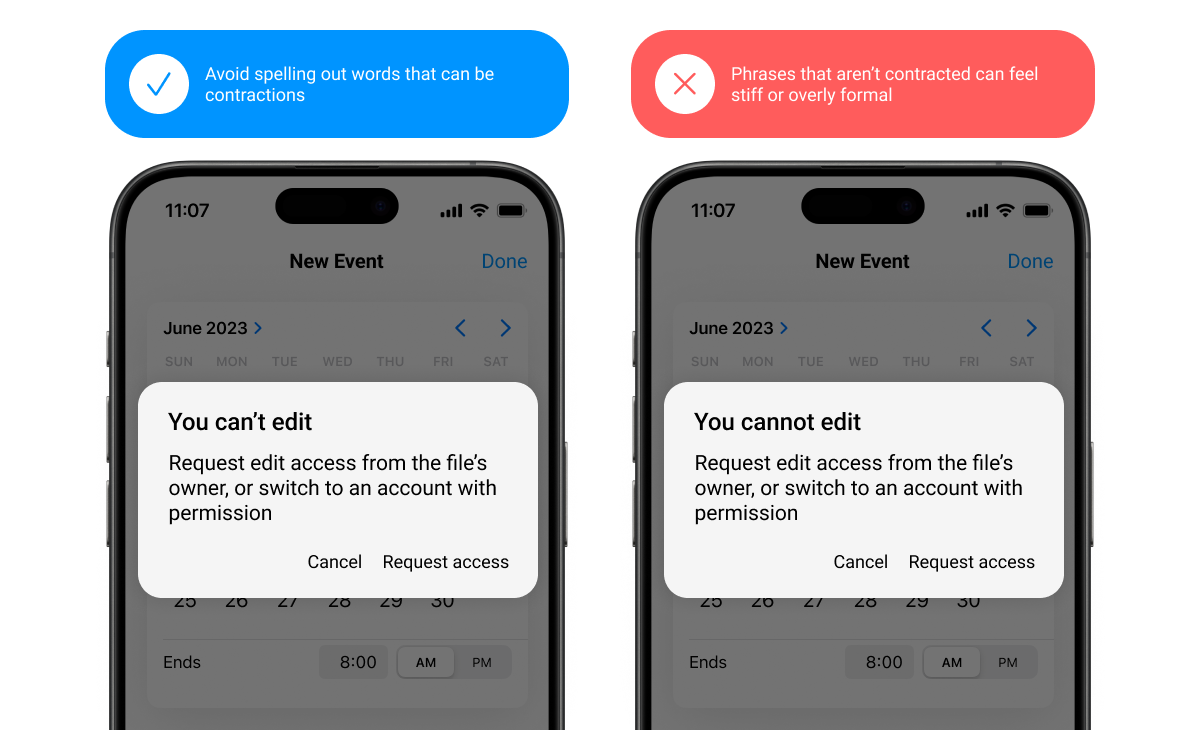
Use contractions
Contractions can make a sentence easier to understand and scan.
However, sometimes "do not" can give more emphasis than "don't” when caution is needed.
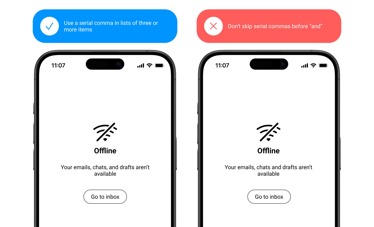
Use serial commas
Use the serial (or Oxford) comma, except before an ampersand. Always place commas inside quotation marks.

Skip colons in headings
For headings on lists of items, do not use colons. For lists within body text, use a colon.
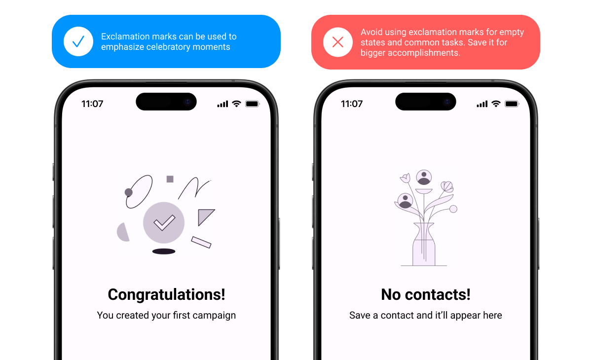
Copy link Use exclamation points sparingly
Exclamation points can come across as shouting or overly friendly. Some exceptions include greetings or congratulatory messages.
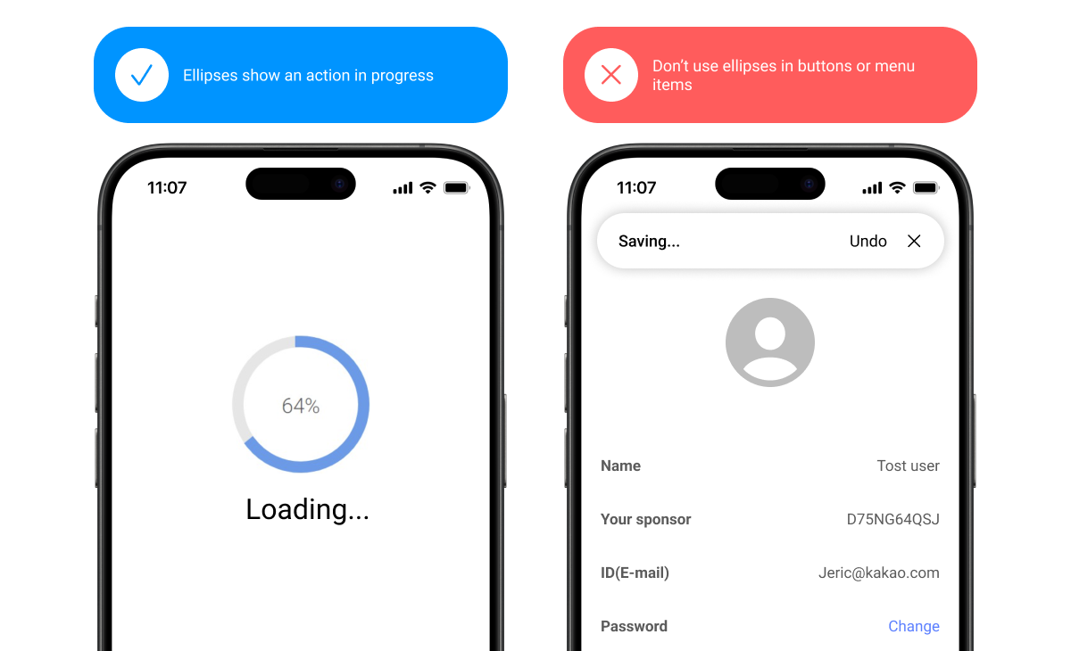
Use ellipses sparingly
Use ellipses to indicate an action in progress or incomplete text. Truncated text may appear with ellipses, but check with your engineering partners before implementing, as this often happens automatically.
Don’t add a space before ellipses. Omit ellipses from menu items or buttons that open a dialog or start a process.
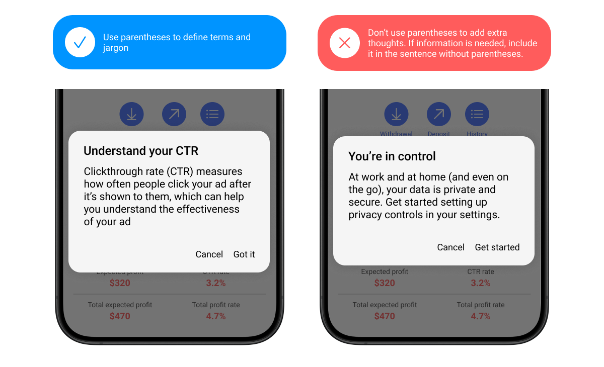
Use parentheses to define terms
Parentheses can be used to define acronyms or jargon or when referencing a source. They shouldn’t be used when adding a side note or an afterthought of a sentence.
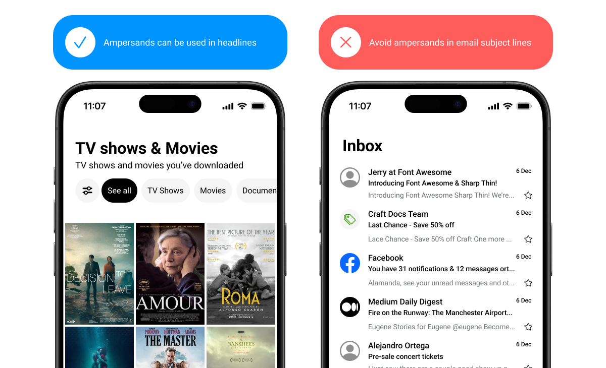
Skip ampersands in body text
The “&” symbol can be used instead of “and” in headlines, column headers, table headers, navigation labels, and buttons. However, when there’s room, spelling out “and” can improve readability and make scanning easier.
“And” should be spelled out in sentences and paragraphs, before the final item in a 3+ item list, and in email subject lines.