December 24, 2023
Design system going beyond platform
Emerging new challenges for more cohesion, more efficiency, and more scalability

Eugene,
UX/UI Designer
*If you click the image above, you can find ASTRSK's design system
As our services have been developing and expanding, we have faced new and significant challenges: ASTRSK now have 4 categories, such as ÈG, Mùsica, ASTRSK, and ASTRSK Blog and each category has its own design system. But now, as the service have become more advanced, and planned the stage of the next service we felt that we need to unify all design systems into one direction for more solid and consistent design. Without further ado, let's take a look at how we have been working on the design system.
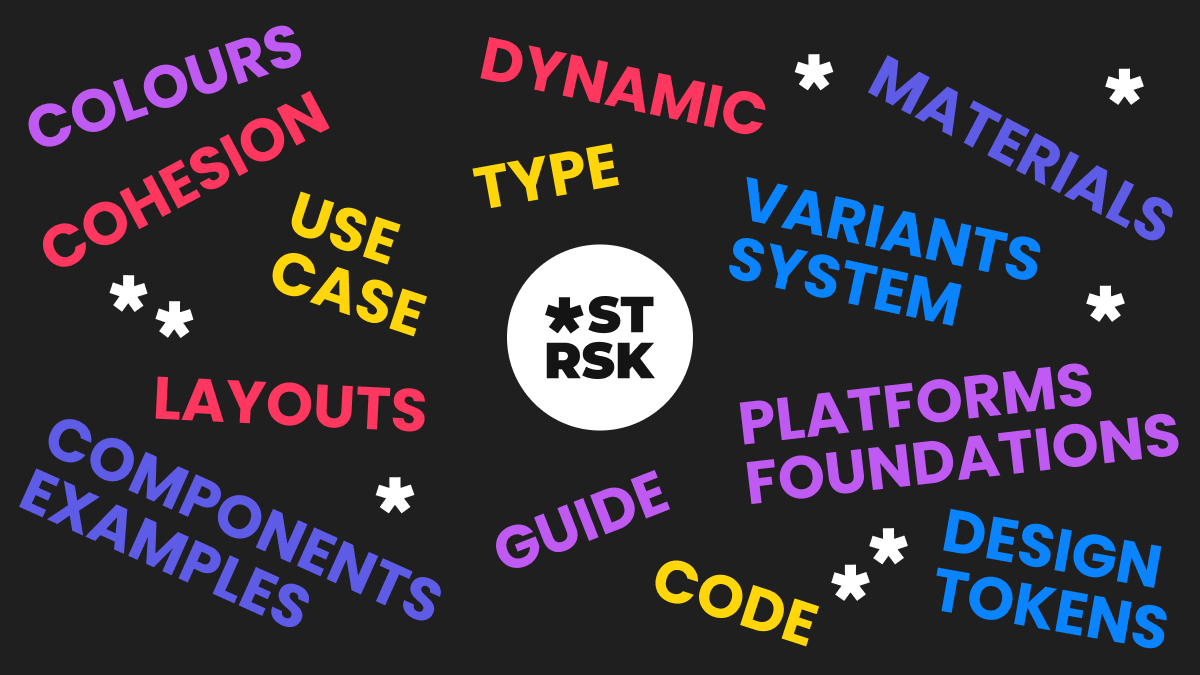
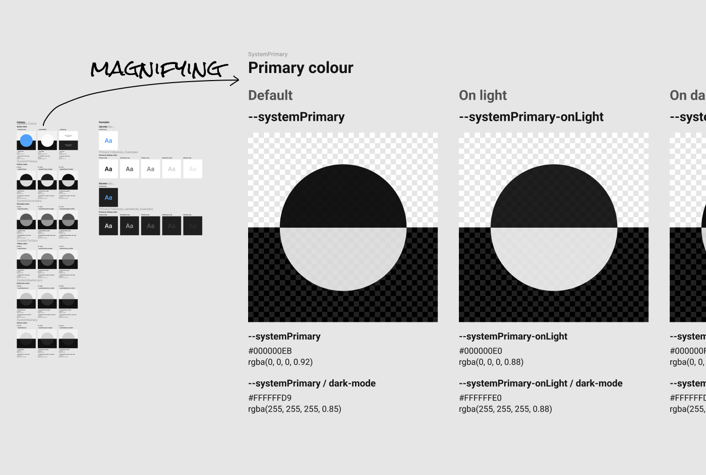
*Components design variation of ASTRSK Design System
Where should we get started?
Our design approach has to be about consistency, not about ubiquitous coverage. Whenever people visited here, we wanted that experience to be as seamless and cohesive as possible. Ensuring that ASTRSK felt inherently “ASTRSK”, regardless of the device or medium, became our core focus. Components have been core to our strategy—rethinking how we approach them, all the way from scoping to execution.
Of course, the journey isn’t without its hurdles. The complexity of managing multiple services while keeping multiple designs on the same page poses a few challenges:
Spotting the discrepancies: the birth of ASTRSK Design System
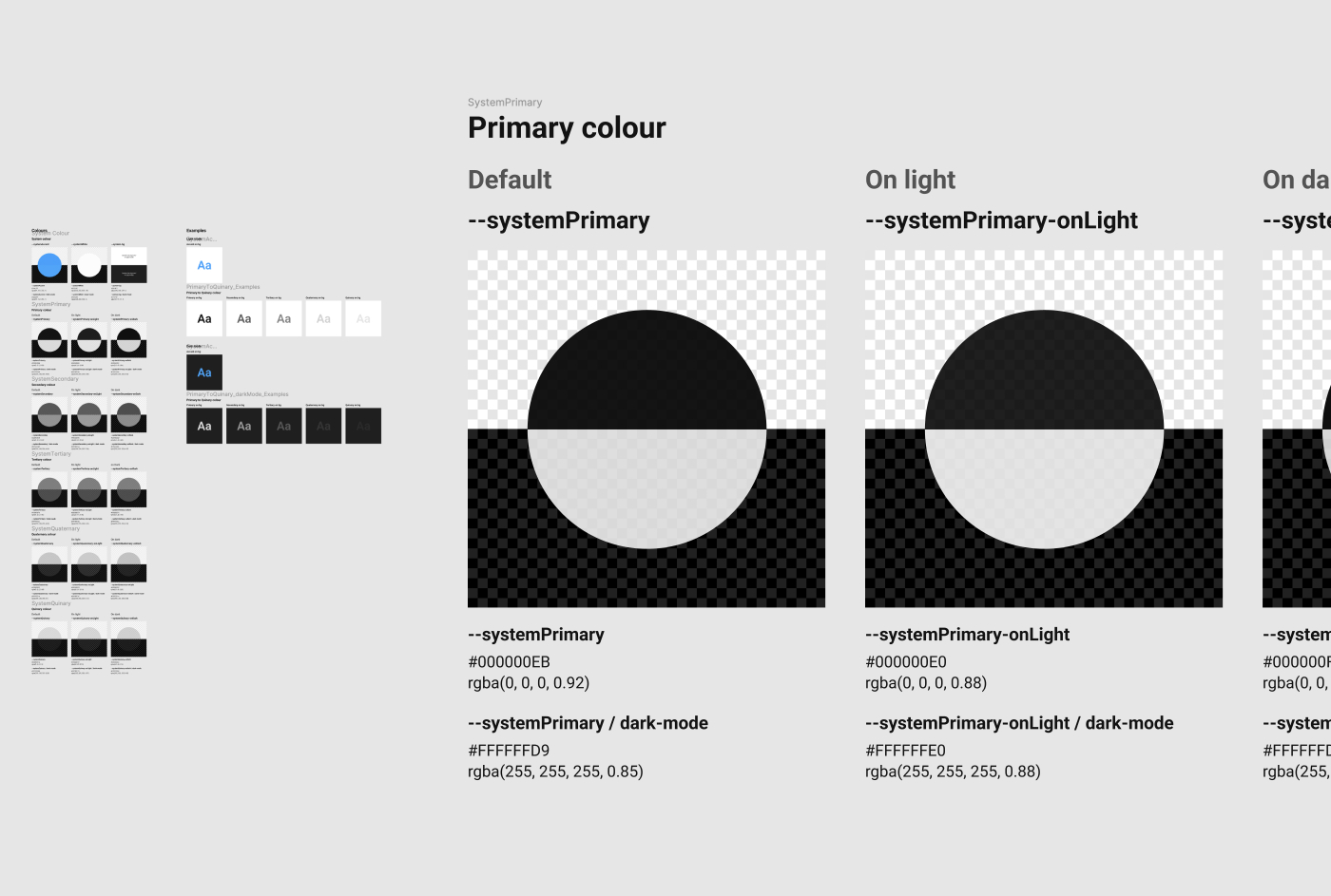
When we introduced ASTRSK, in 2023 September, all services is designed for desktop-centric experiences. In essence, it acted as a vast catalog of ever-growing and evolving UI components. Meanwhile, we haven’t noticed that it is SUPER uncomfortable for you to experience in mobile. So we decided to adopt design tokens for foundational design decisions, such as colour schemes and type stiles. And, as our journey progressed, we recognized the need for more commonality between our subsystems.
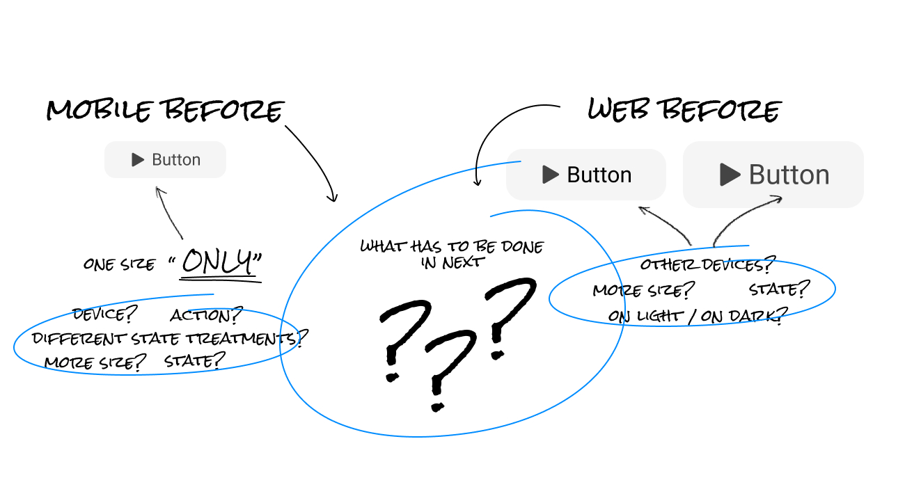
Before: Button components for ASTRSK's Mobile and Web systems
As ASTRSK’s been growing and expanding, so too did our design teams’ appetite for more refined components. It was evident that the pendulum had swung too far towards web, and a recalibration was necessary definitely. So, we started to think of how to make solid and effective design systems that can be used in anywhere and any cases, and by anyone. While creating and expanding platform, we began developing cross-platform components at the outset, as opposed to an afterthought.
Define all circumstances in which we can respond flexibly
At the outset, what we did was define all the circumstances that could be arising. Before we got new design system, all the actions(hover, press, and interactions etc.), colour and typography scheme, components’ details, and layouts are not defined.
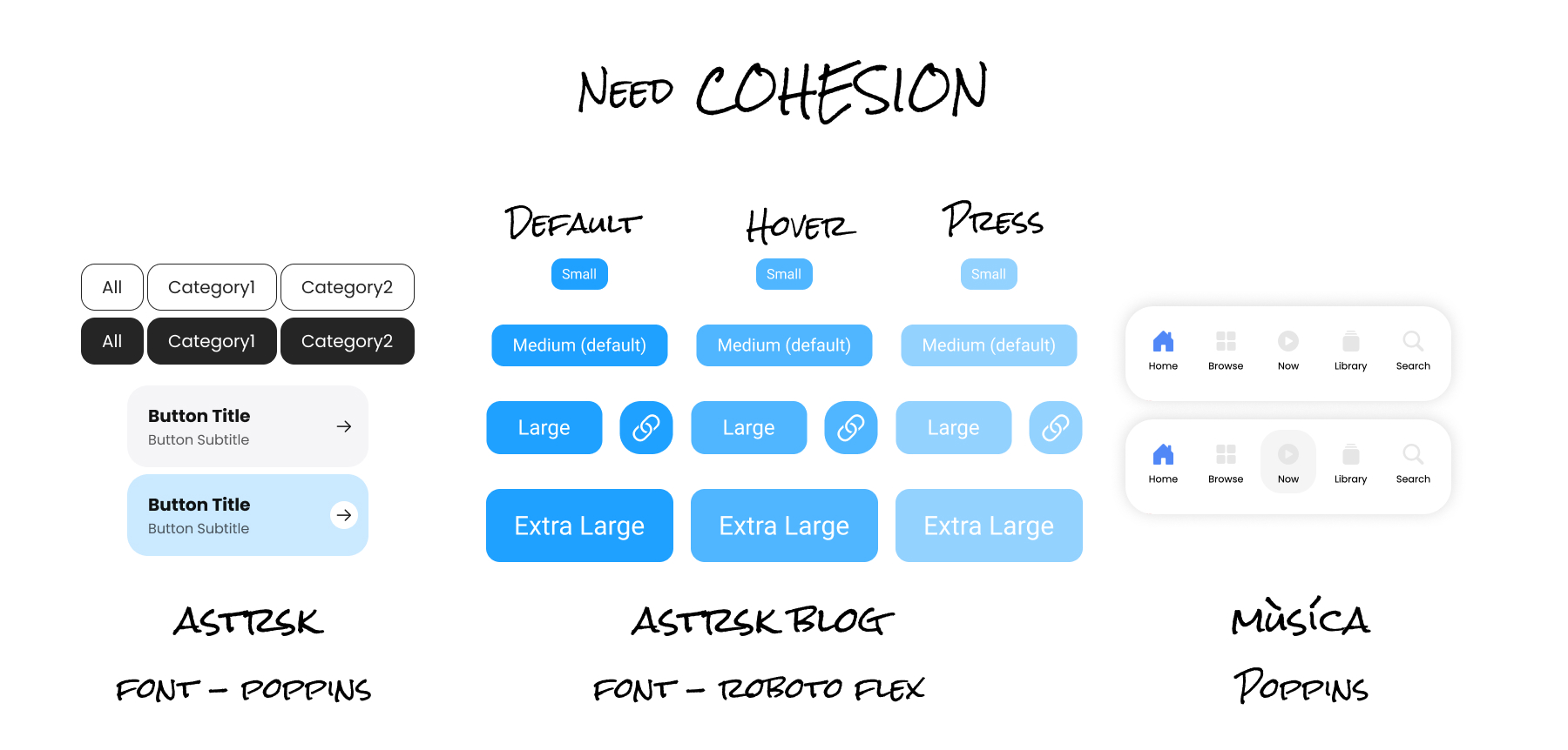
For examples, in ASTRSK, button hover colors were specified separately, but in ASTRSK Blog, opacity was applied to the button. In addition, the typography scheme was also different. In ASTRSK, we used the font family of Poppins, but in ASTRSK Blog, we used the font family of Roboto flex with font variation(font-variation-settings: "wght" 100, "wdth" 100, "opsz" 8;)
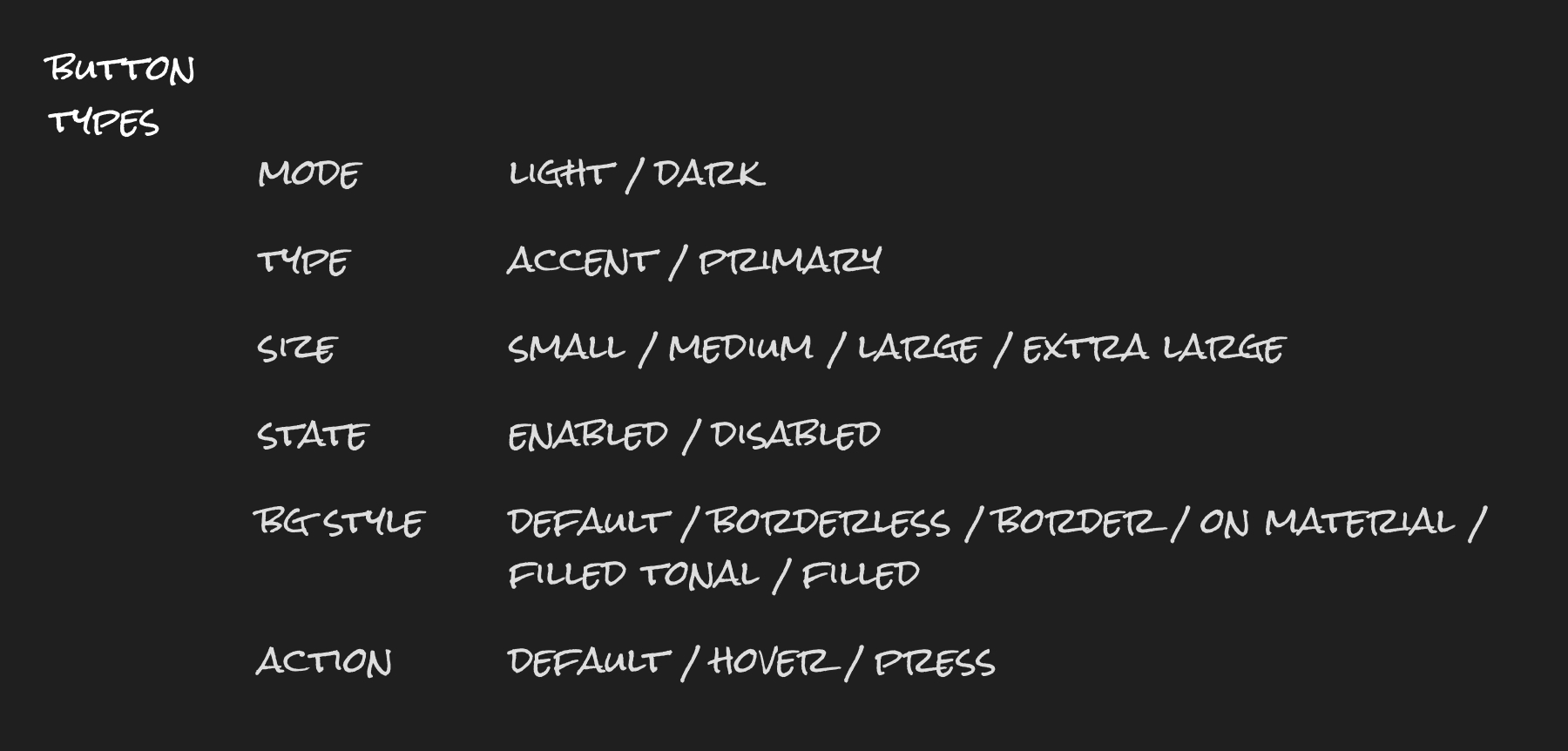
Classifying every single circumstances
UI components that can be used flexibly in various situations
Colour scheme
UI components that can be used flexibly in various situations