December 17, 2023
Analysis of dark mode
A HEX code analysis of 5 apps such as Apple Music, Spotify, YouTube, Instagram, and Twitter(X)

Eugene,
UX/UI Designer
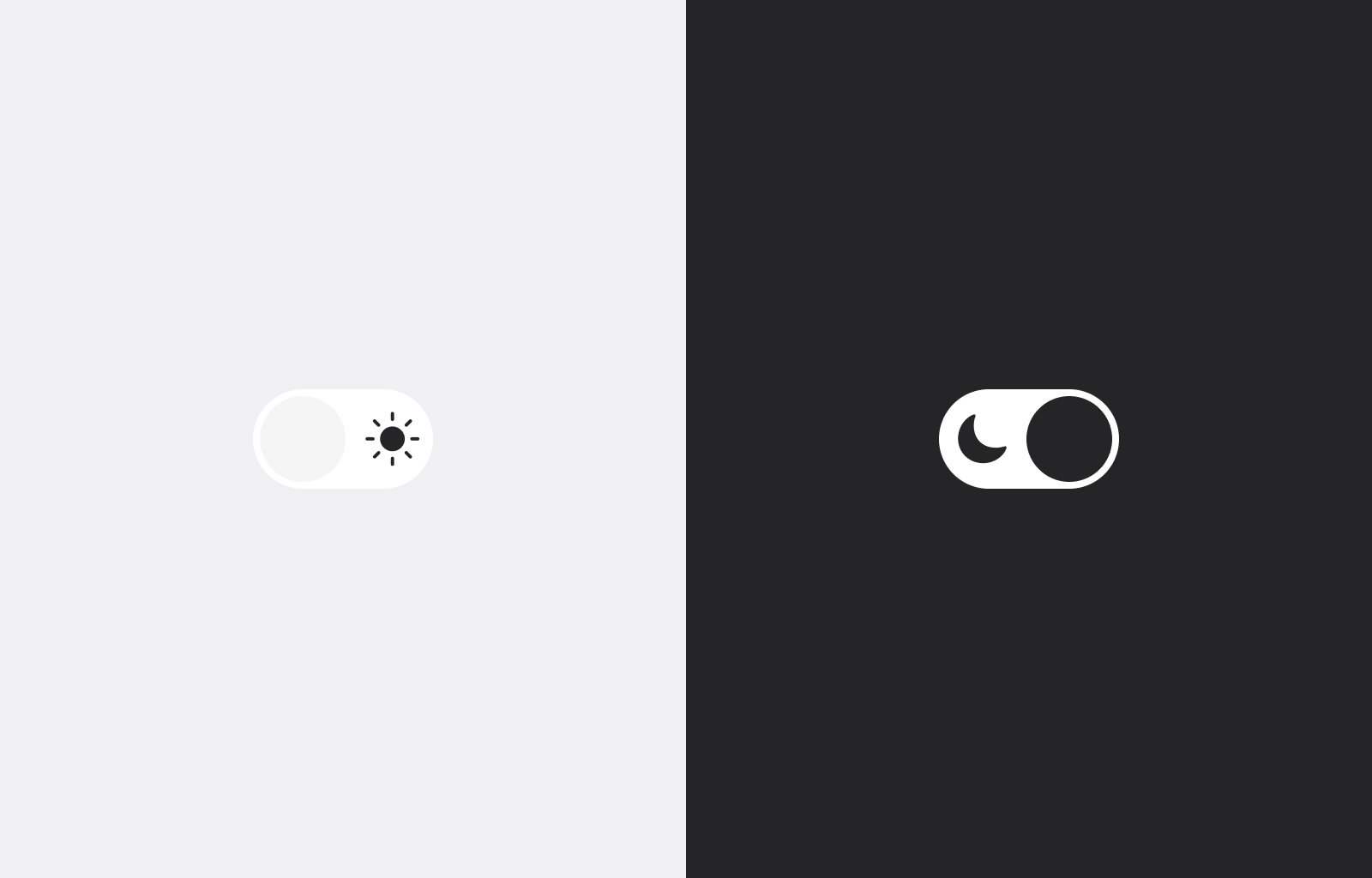
For those of us who are enthusiastic fan of using dark mode, we already understand that it’s more than just having white text on a black display. Some people say the reason why they use dark mode is just it is aesthetic, some say they don’t want to deal with eye burn at night, and some say it is good for eye health.
*Using dark mode is helpful in that it's easier on the eyes than a stark, bright white screen. However, using a dark screen requires your pupils to dilate which can make it harder to focus on the screen. - All About Vision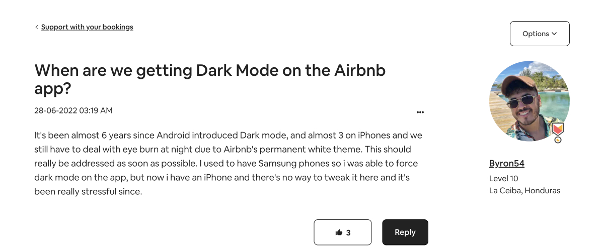
Dark mode includes various shades of gray to add depth and visual appeal to your application. Moreover, when considering the variety of services and functions provided within a single app, the spectrum of gray expands even further.
Just out of curiosity(actually sparked within me), I’ve looked into the dark mode palettes of websites and apps that a lot of people frequently use. By taking a closer look of 5 frequently used apps such as Apple Music, Spotify, YouTube, Instagram, and Twitter(X) let’s extract colour hex codes and analyze palettes of them.
Understanding of colour system
The RGB colour space and grayscale axes
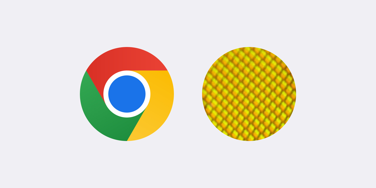
When it comes to talking about colours in the digital world, it’s important to understand the concept and system of RGB colour space. As you already know, RGB, widely used colour system are made up of combinations of 3 main colours: Red(R), G(Green), and Blue(B). As you can see from the image below, actually, the yellow part of the Chrome icon is the result of a combination of red and green.
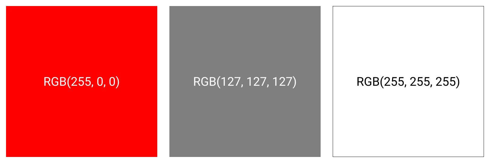
Each color is assigned a weight ranging from 0(min) to 255 (max). Typically, these weights are presented as a triplet, such as (R weight, Green weight, Blue weight).
For example, pure red has no weights of green and blue, so its RGB representation is (255, 0, 0). A medium gray, on the other hand, is a combination of whole parts weighted equally resulting in an RGB value of (127, 127, 127). In this system, black is represented as (0, 0, 0), signifying a lack of colour, while white is represented as (255, 255, 255), including all the colours.
Visualizing the RGB colour space can be done by imagining a cube with red, green, and blue as the 3d axes. Each of colour can be thought of as a point within this cube.
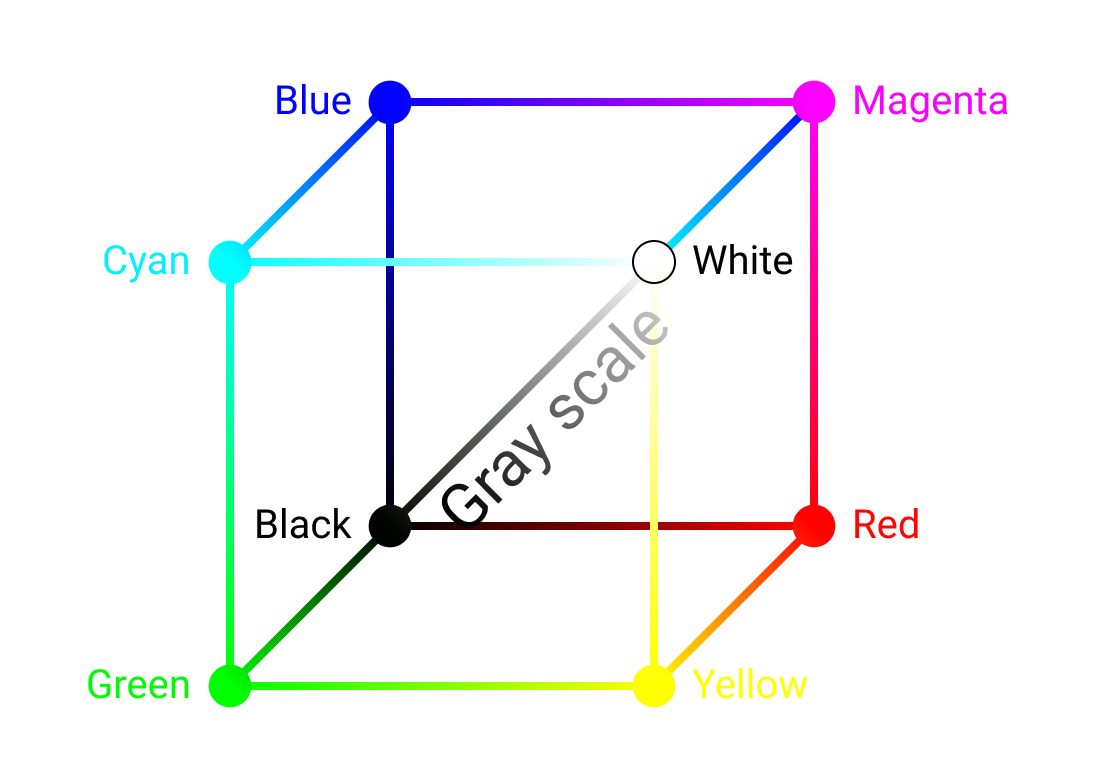
Then, let’s take a closer look of the grayscale axes within this cube. That axes extends from black to white, representing various shades of gray. Along this axes, each colour has equal values for R,G, and B. The more closer the RGB values are to 0, the darker the shade of gray.
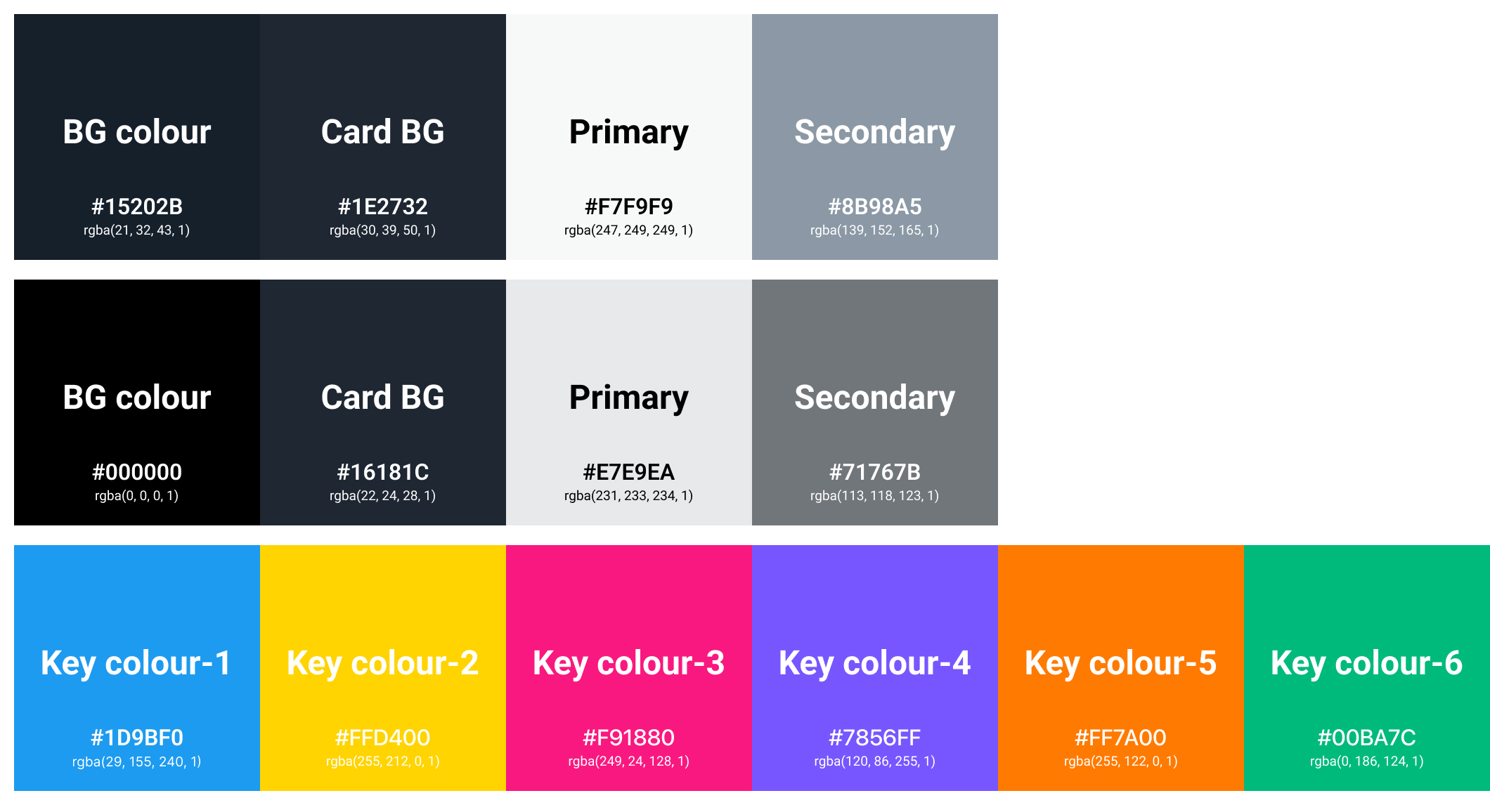
Colours that surround the grayscale axes are not pure gray, but rather slightly tinted. For example, Facebook uses (36, 36, 38). Notice how even though values are close to each other, the blue value is the largest. So, this shade of gray is a bit blue.
HEX codes
What is HEX codes?
A colour hex code is a hexadecimal way to represent a color in RGB format by combining three values – the amounts of red, green and blue in a particular shade of colour. These colour hex codes have been an integral part of HTML, CSS, SVGs, and more for web design, and remain a key way of representing colour formats digitally. Usually we precede a HEX code with a number sign(#). If we convert the aforementioned colours to HEX, we can have:
Red: (255, 0 0) / HEX: #FF0000
Black: (0, 0, 0) / HEX: #000000
Medium gray: (127, 127, 127) / HEX: #7F7F7F
White: (255, 255, 255) / HEX: #FFFFFF
Facebook gray (36, 36, 38) / HEX: #242426
Anatomy of dark mode apps
Across analysis of 5 apps, I’ve figured out a some general patterns that most dark mode apps follow:
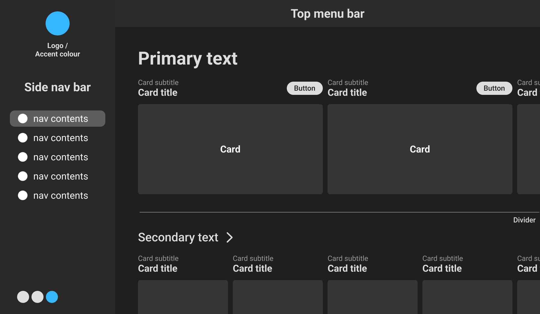
In the modern dark mode design, there’re several key elements that contribute to the overall visual experience. Let’s take a closer look at these things:
Background
The background serves as the dominant colour in dark mode and is typically darker than pure black, often a few shades lighter.
Menu bar
Menu bar is commonly positioned on the left side of app. It helps users navigate the service’s functions and is designed to be little bit lighter than the background colour, providing a visual contrast.
Card
With the influence of Material Design of Google, cards have become a popular design element in modern interfaces. It organize contents into distinct compartments and are typically presented in a lighter shade of gray.
Divider
To help separate content and structure related content, divider is used in various places such as cards, menu bars, background and etc. It is even lighter in colour compared to the surrounding elements, representing a visual break.
Button
Button is one of the elements that trigger users to take specific actions and interact with them. Thinking of aforementioned circumstances, it can be gray or often adopt the accent colour of the service, representing a visual cue for user interaction.
Primary and secondary text
The whole point of the design is to separate the primary from the secondary. In other words: focus users' attention on the main thing to get to the action or find the information they need as quickly as possible. To highlight the primary and direct the user’s focus on it, primary text is usually designed to the lightest in colour, often very close to white, ensuring clear visibility, prominence, and clear intention of page. Secondary text is slightly darker than the primary text and it complements the primary content and provides additional information and context.
Icon
Icon plays a vital role in conveying ideas and functions without relying on text. Of course, it can also be combined with text to trigger actions more clearer, provide information more further clarity. It is designed to be light and easily distinguishable in dark mode.
Explore how these elements come together in popular applications
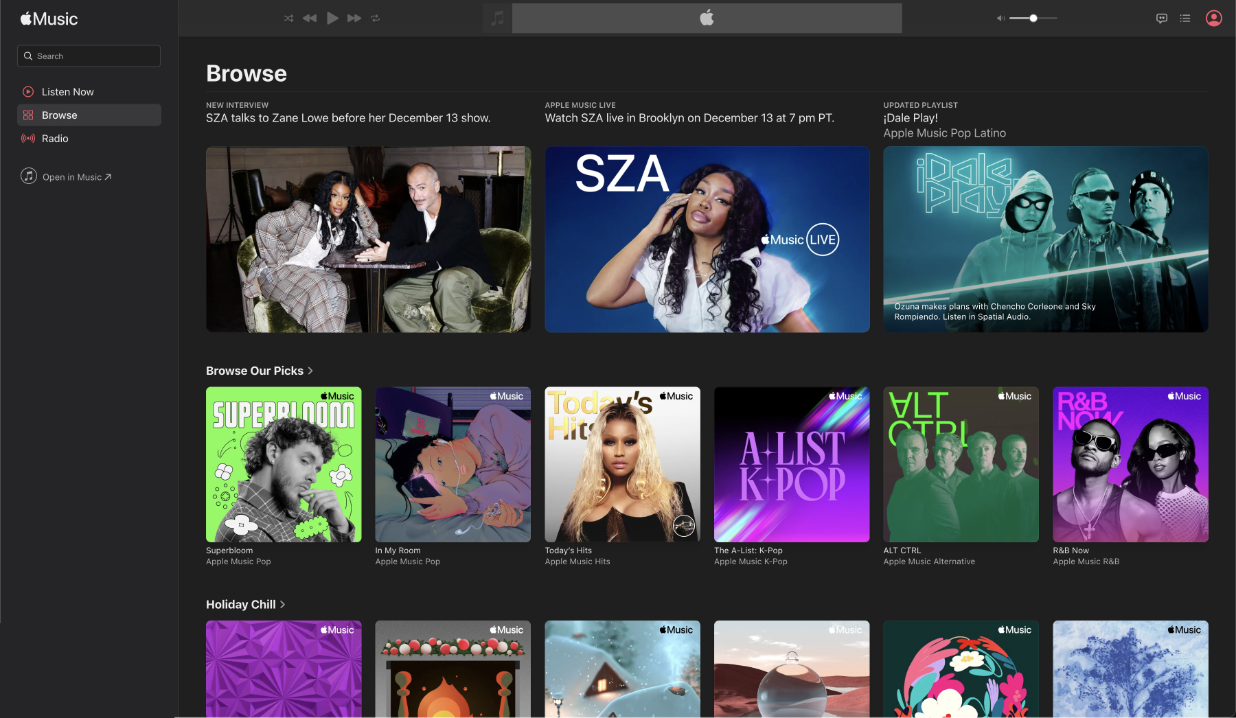
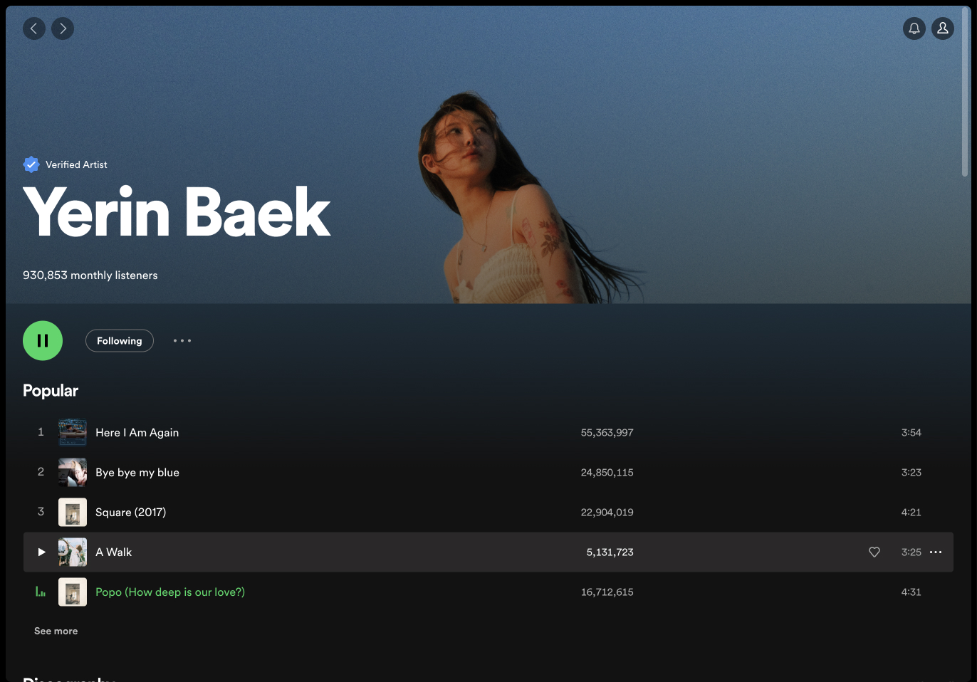
All HEX codes following is confirmed through Google Chrome developer mode.Apple Music
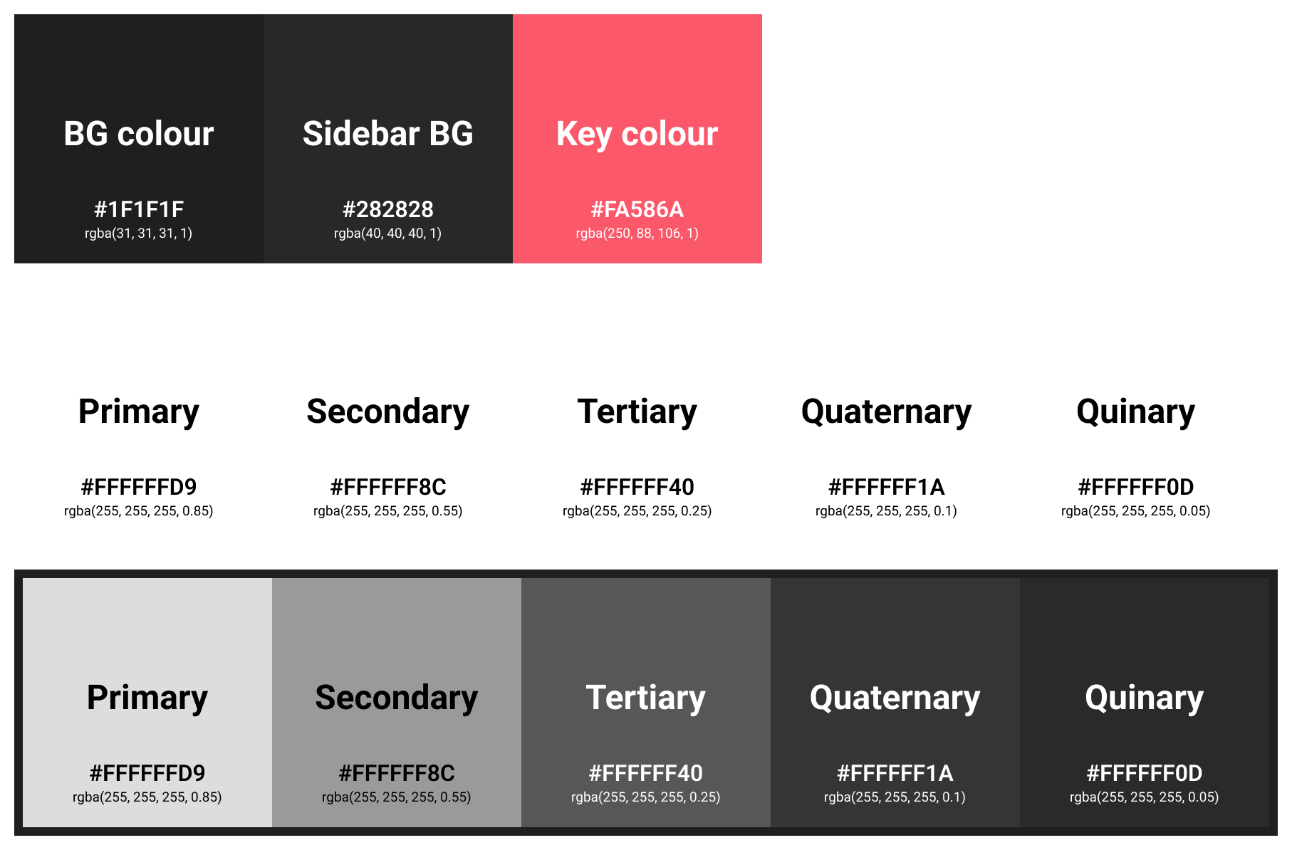
If you turn on dark mode in your Mac system settings, all native Apple apps such as Settings, Apple Music, Safari, Notes, iMessage, Notes, Photos, Calendar, and etc will be available in dark mode.
Unlike other services, Apple uses white from the primary colour to the quinary colour, and differentiates them by setting density of opacity. The colour-specific CSS code we usually know is a 6-digit hex code or RGB format such as rgba(255, 255, 255, 0.8). In Google Chrome Developer Tools, the hex code is displayed as 8 digits, and the last 2 digits use an alpha hex code with the percentage of opacity. I recommend that anyone who needs to know search for that conversion value on Google.
Spotify
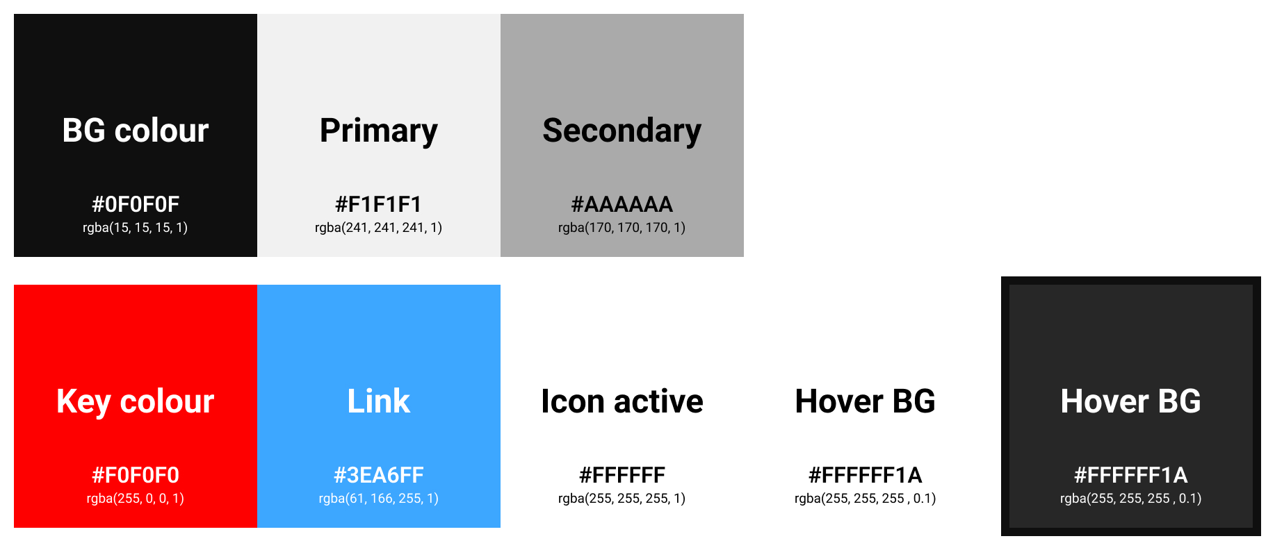
Interestingly, Spotify only supports dark mode. There are many articles on Google that explain how to change to light mode, but I don’t think it’s officially supported by Spotify. Another one is the Spotify background has a white gradient. They applied background base colour(#121212) on the background colour(#000000), and designed primary text to pure white(#FFFFFF) and secondary text to standard gray(#A7A7A7).
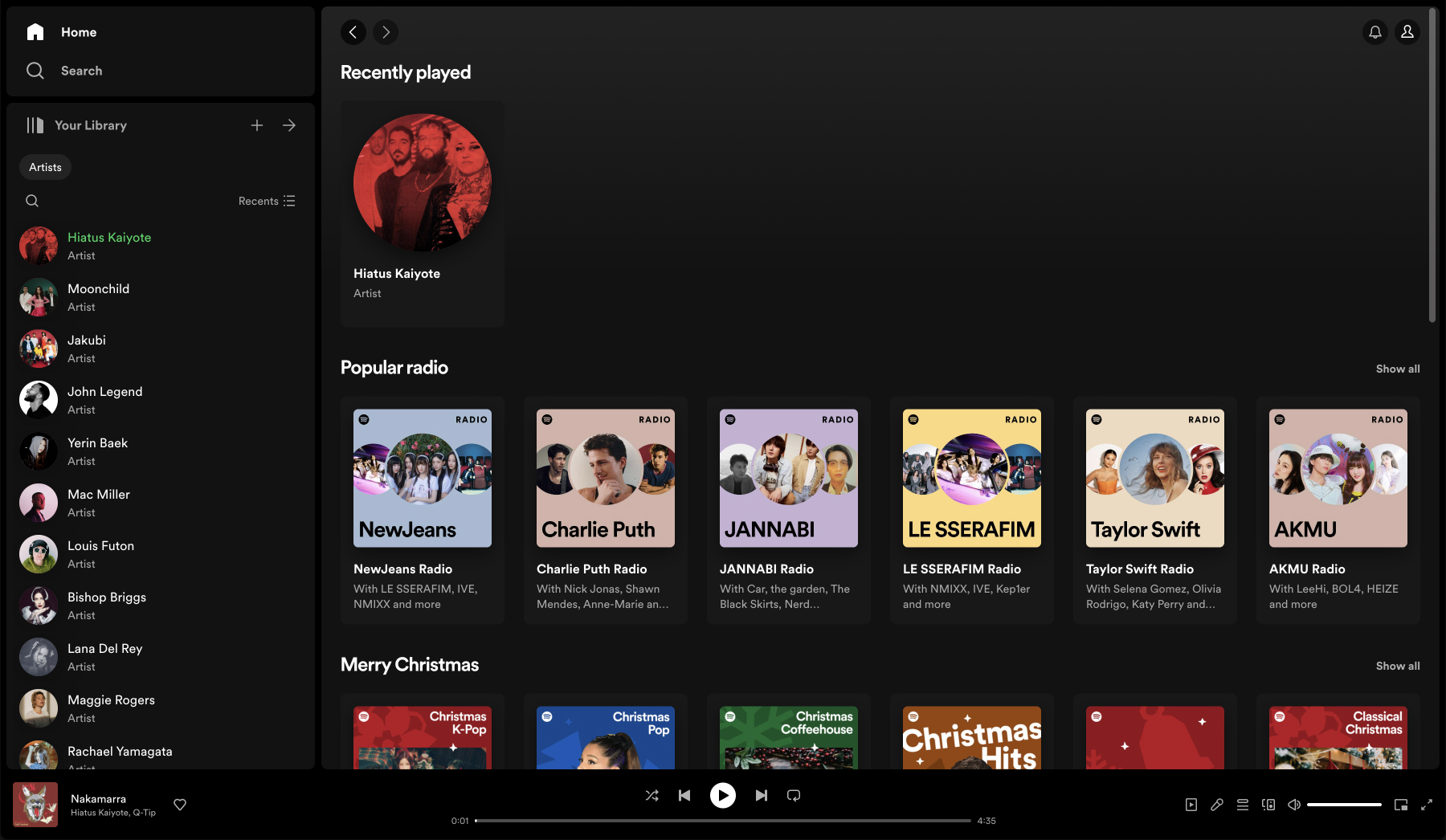
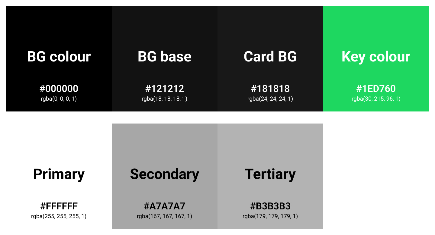
Here, the gradient system makes sense for a long list of items and it also provides some reasonable depth. And accent colour(Spotify green) is subtly used to break up the shades of gray.
YouTube
The dark mode palette used by YouTube is almost uninteresting. Unlike the apps above, there doesn’t seem to be an accent colour. You don’t see the YouTube red anywhere in the app except the logo in the top left and icon in the subscriptions part. Text colours are organized into 2 colours: primary and secondary colours, and gray colour is exactly on the grayscale axes.

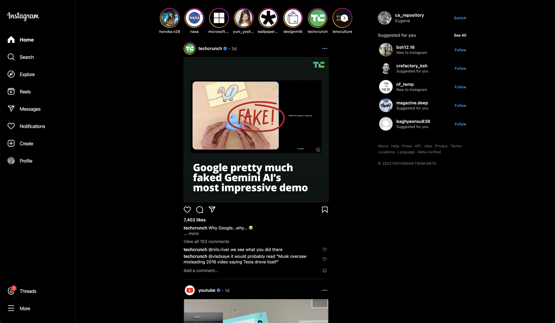
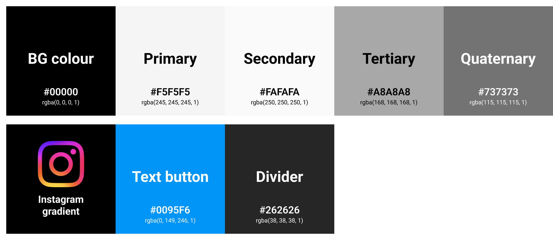
Like Lights out mode of Twitter(X), and Spotify, Instagram uses black(#000000) as background colour. Interestingly, secondary colour(#FAFAFA) is little bit lighter than primary colour(#F5F5F5). Secondary colour is used to user ID on card.
Just by looking at the page, you can find Instagram gradients(accent colours) in a lot of places, and they are used when a user’s story has been updated and they are used to divide between user’s contents you are following and suggested posts.
Dividers are also used in a lot of places, such as to separate card sections and side menu, to distinguish between cards, and to display an outline when the size of an image or video is not optimized.
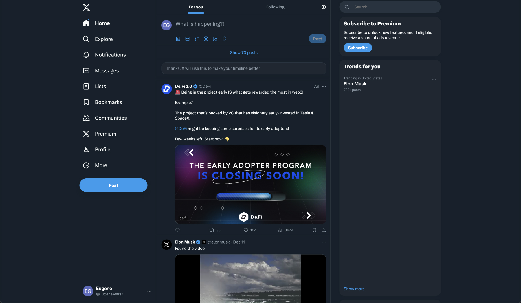
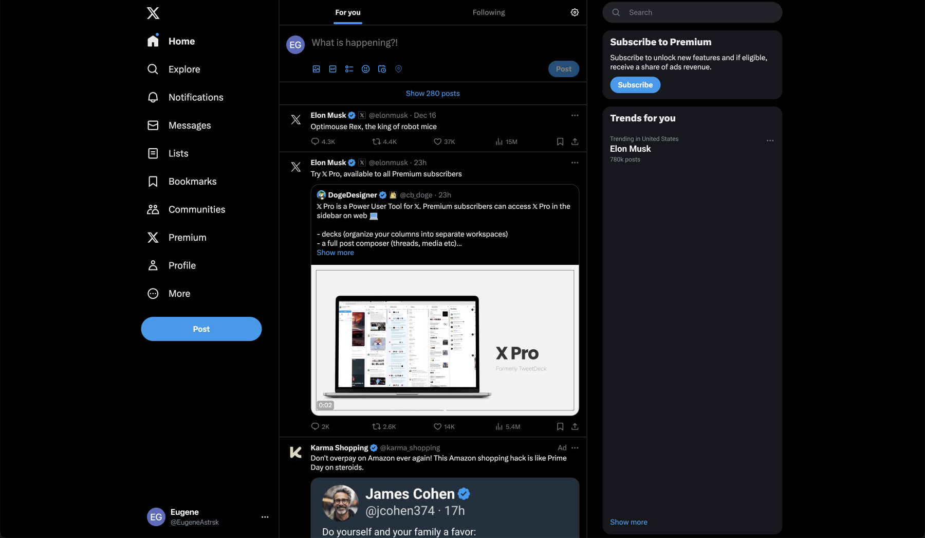
Twitter(X)
Twitter(X) supports 2 versions of dark mode, the first one is Dim mode which have #15202B background colour, and the second one is Lights out mode which have #000000(black) background colour. Also, you can change accent colour in Display setting and choose one of 6 colours.
Right off the bat, just by looking at the RGB values, X heavily favors blue for its dark mode. For each of the shades, the B value is the highest.
X utilizes cards with dividers. And they are little bit lighter than the background to appear closer, giving a perception of depth. The dividers on the cards are a lighter shade of blue. Primary text uses #F7F9F9, not pure white, and secondary text uses #8B98A5, light blue. Accent colour used throughout such as button, text button, and check mark on profile label.